Introduction to R, Class 4: Data Visualization
Objectives
So far in this course, we have:
- learned basic R syntax, including working with objects and functions
- imported data into R for manipulation with base R methods
- loaded
tidyverseand used its data science tools to manipulate and filter data
This last material continues our explorations of tidyverse with a
specific focus on data visualization. After completing this material,
you should be able to use ggplot2 in R to:
- create and modify scatterplots and boxplots
- represent time series data as line plots
- split figures into multiple panels
- customize your plots
Getting set up
Since we are continuing to work with data in tidyverse, we need to
make sure all of our data and packages are available for use.
Open your project in RStudio. Create a new script called class4.R, add
a title, and enter the following code with comments:
# load library
library(tidyverse)
## ── Attaching packages ───────────────────────────────────────────────────────────────── tidyverse 1.3.0 ──

## ✓ ggplot2 3.3.2     ✓ purrr   0.3.4
## ✓ tibble  3.0.3     ✓ dplyr   1.0.1
## ✓ tidyr   1.1.1     ✓ stringr 1.4.0
## ✓ readr   1.3.1     ✓ forcats 0.5.0

## ── Conflicts ──────────────────────────────────────────────────────────────────── tidyverse_conflicts() ──
## x dplyr::filter() masks stats::filter()
## x dplyr::lag()    masks stats::lag()
# read in first filtered data from last class
birth_reduced <- read_csv("data/birth_reduced.csv")
## Parsed with column specification:
## cols(
##   .default = col_character(),
##   age_at_diagnosis = col_double(),
##   days_to_death = col_double(),
##   days_to_birth = col_double(),
##   days_to_last_follow_up = col_double(),
##   cigarettes_per_day = col_double(),
##   years_smoked = col_double(),
##   year_of_birth = col_double(),
##   year_of_death = col_double()
## )

## See spec(...) for full column specifications.
# read in second filtered data from last class
smoke_complete <- read_csv("data/smoke_complete.csv")
## Parsed with column specification:
## cols(
##   .default = col_character(),
##   age_at_diagnosis = col_double(),
##   days_to_death = col_double(),
##   days_to_birth = col_double(),
##   days_to_last_follow_up = col_double(),
##   cigarettes_per_day = col_double(),
##   years_smoked = col_double(),
##   year_of_birth = col_double(),
##   year_of_death = col_double()
## )
## See spec(...) for full column specifications.
If you have trouble accessing your data and see an error indicating the file is not found, it is likely one of the following problems:
- Check to make sure your project is open in RStudio. You should see
the path to your project directory (e.g.,
~/Desktop/introR) appear at the top of the console (above the window showing output). If this doesn’t appear, you should save your script in your project directory, then go toFile -> Open Project. Navigate to the location of your project directory and open the folder, then try to reexecute your code. - Make sure you have the two datasets (
birth_reduced.csvandsmoke_complete.csv) in yourdatadirectory. Please reference the materials from class 3 to filter the original clinical dataset and export these data.
Once your data are imported appropriately, we can create a quick plot:
# simple plot from base R from the smoke_complete dataset
plot(x=smoke_complete$age_at_diagnosis, y=smoke_complete$cigarettes_per_day)
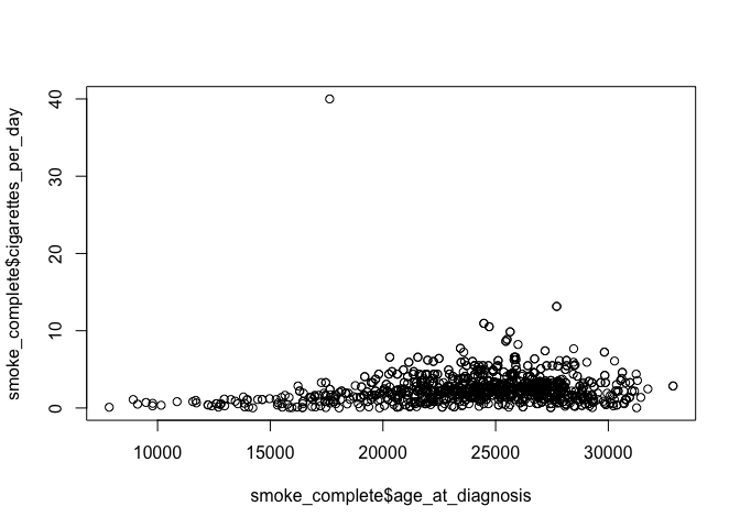
This plot is from base R. It gives you a general idea about the data,
but isn’t very aesthetically pleasing. Our work today will focus on
developing more refined plots using ggplot2, which is part of the
tidyverse.
Intro to ggplot2 and scatterplots
There are three steps to creating a ggplot. We’ll start with a scatterplot, which is used to compare quantitative (continuous) variables.
- bind data: create a new plot with a designated dataset
# basic ggplot
ggplot(data = smoke_complete) # bind data to plot

The last line of code creates an empty plot, since we didn’t include any instructions for how to present the data.
- specify the aesthetic: maps the data to axes on a plot
# basic ggplot
ggplot(data = smoke_complete, aes(x = age_at_diagnosis,
                           y = cigarettes_per_day)) # specify aesthetics (axes)
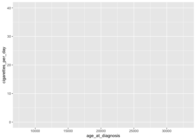
This adds labels to the axis, but no data appear because we haven’t specified how they should be represented
- add layers: visual representation of plot, including ways through which data are represented (geometries or shapes) and themes (anything not the data, like fonts)
ggplot(data = smoke_complete,
       mapping = aes(x = age_at_diagnosis, y = cigarettes_per_day)) +
  geom_point() # add a layer of geometry

The plus sign (+) is used here to connect parts of ggplot code
together. The line breaks and indentation used here represents the
convention for ggplot, which makes the code more readible and easy to
modify.
In the code above, note that we don’t need to include the labels for
data = and mapping =. It’s also common to include the mapping
(aes) in the geom, which allows for more flexibility in customizing
(we’ll get to this later!).
ggplot(smoke_complete) +
  geom_point(aes(x = age_at_diagnosis, y = cigarettes_per_day))
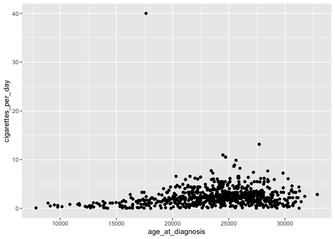
This plot is identical to the previous plot, despite the differences in code.
Customizing plots
Now that we have the data generally displayed the way we’d like, we can start to customize a plot.
# add transparency with alpha
ggplot(smoke_complete) +
  geom_point(aes(x = age_at_diagnosis, y = cigarettes_per_day), alpha = 0.1)
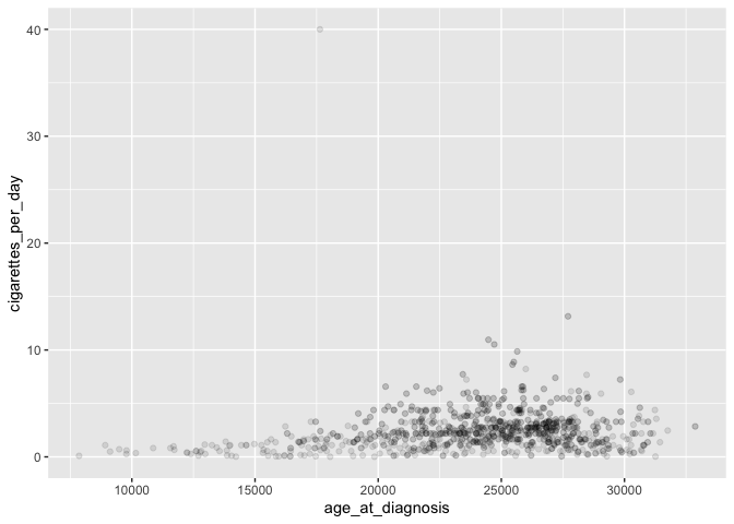
Transparency is useful to help see the distribution of data, especially when points are overlapping.
# change color of points
ggplot(smoke_complete) +
  geom_point(aes(x = age_at_diagnosis, y = cigarettes_per_day),
             alpha = 0.1, color = "green")
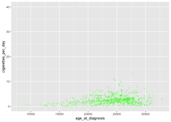
For more information on colors available, look here.
We can also color points based on another (usually categorical) variable:
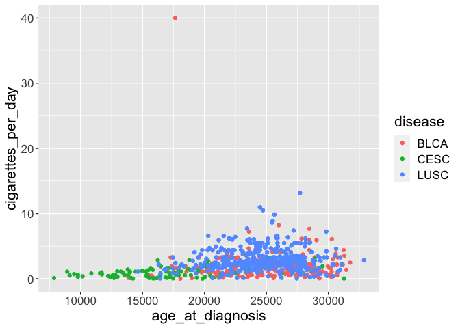
# plot disease by color
ggplot(smoke_complete) +
  geom_point(aes(x = age_at_diagnosis, y = cigarettes_per_day,
                 color = disease),
             alpha = 0.1)
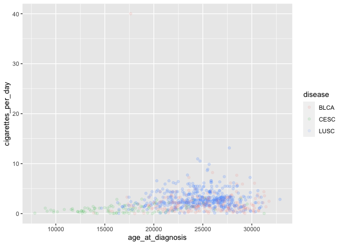 Note the location
of
Note the location
of color= with the other aesthetics, as well as the lack of quotation
marks around disease.
Coloring by a variable automatically adds a legend as well.
We can also change the general appearance of the plot (background colors and fonts):
ggplot(smoke_complete) +
  geom_point(aes(x = age_at_diagnosis, y = cigarettes_per_day, color = disease), alpha = 0.1) +
  theme_bw() # change background theme
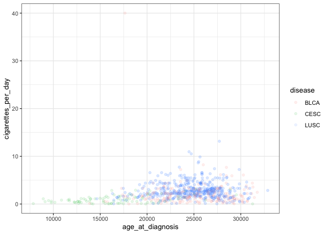
This adds another layer to our plot representing a black and white theme. A complete list of pre-set themes is available here, and we’ll cover ways to customize our own themes later in this lesson.
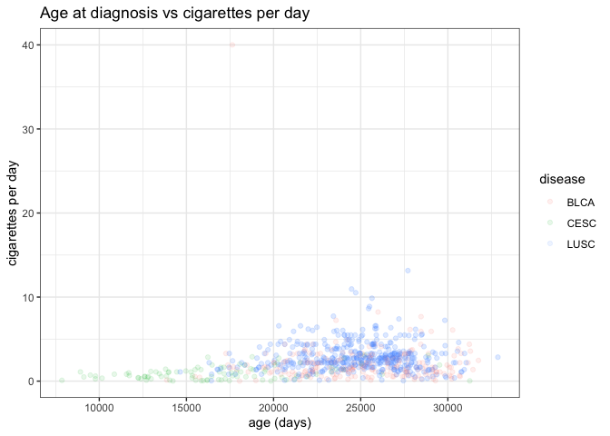
While the axes are currently sufficient, they aren’t particularly
attractive. We can add a title and replace the axis labels using labs:
ggplot(smoke_complete) +
  geom_point(aes(x = age_at_diagnosis, y = cigarettes_per_day, color = disease), alpha = 0.1) +
  labs(title = "Age at diagnosis vs cigarettes per day", # title
       x="age (days)", # x axis label
       y="cigarettes per day") +# y axis label
  theme_bw()
Another common feature to customize involves the orientation and
appearance of fonts. While this can be controlled by default themes like
theme_bw), you can also control different parts independently. For
example, we can make a dramatic modification to all text in the plot:
ggplot(smoke_complete) +
  geom_point(aes(x = age_at_diagnosis, y = cigarettes_per_day, color = disease)) +
  theme(text = element_text(size = 16)) # increase all font size
Alternatively, you can alter only one specific type of text:
ggplot(smoke_complete) +
  geom_point(aes(x = age_at_diagnosis, y = cigarettes_per_day, color = disease)) +
  theme(axis.text.x = element_text(angle = 90, hjust = 0.5, vjust = 0.5)) # rotate and adjust x axis text
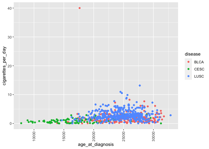 This rotates and
adjusts the horizontal and vertical arrangement of the labels on only
the x axis. Of course, you can also modify other text (y axis, axis
labels, legend).
This rotates and
adjusts the horizontal and vertical arrangement of the labels on only
the x axis. Of course, you can also modify other text (y axis, axis
labels, legend).
After you’re satisfied with a plot, it’s likely you’d want to share it with other people or include in a manuscript or report.
# create directory for output
dir.create("figures")
# save plot to file
ggsave("figures/awesomePlot.jpg", width = 10, height = 10, dpi = 300)
This automatically saves the last plot for which code was executed. You
can view your figures/ directory to see the exported jpeg file. This
command interprets the file format for export using the file suffix you
specify. The other arguments dictate the size (width and height) and
resolution (dpi).
Challenge-scatterplot
Create a scatterplot showing age at diagnosis vs years smoked with points colored by gender and appropriate axis labels.
Box and whisker plots
Box and whisker plots compare the distribution of a quantitative variable among categories.
# creating a box and whisker plot
ggplot(smoke_complete) +
  geom_boxplot(aes(x = vital_status, y = cigarettes_per_day))
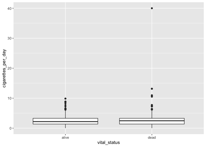
The main differences from the scatterplots we created earlier are the
geom type and the variables plotted.
We can change the color similarly to scatterplots:
# adding color
ggplot(smoke_complete) +
  geom_boxplot(aes(x = vital_status, y = cigarettes_per_day), color = "tomato")
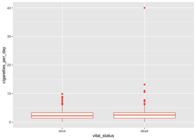
It seems weird to change the color of the entire box, though. A better option would be to add colored points to a black box and whisker plot:
# adding colored points to black box and whisker plot
ggplot(smoke_complete) +
  geom_boxplot(aes(x = vital_status, y = cigarettes_per_day)) +
  geom_jitter(aes(x = vital_status, y = cigarettes_per_day), alpha = 0.3, color = "blue")
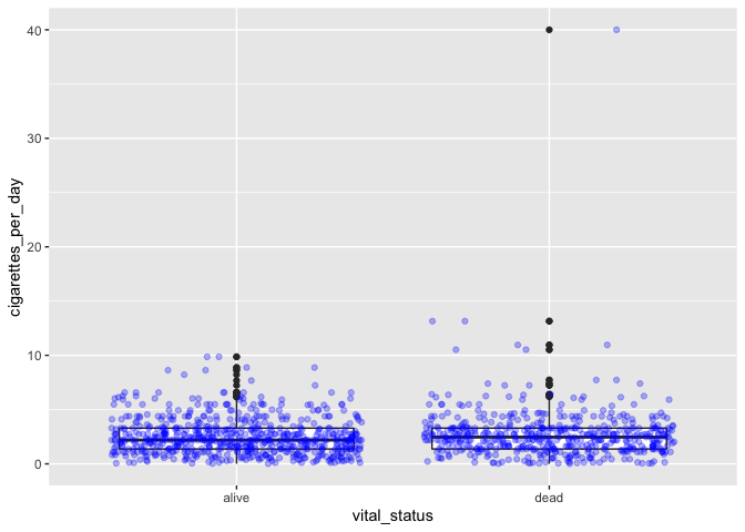
Jitter references a method of randomly offsetting points slightly to allow them to be seen and interpreted more easily.
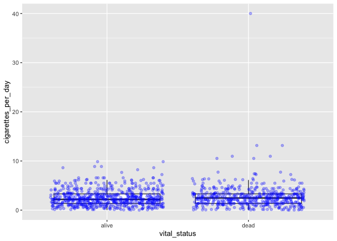
This method, however, effectively duplicates some data points, since all
points are shown with jitter and the boxplot shows outliers. You can use
an option in geom_boxplot to suppress plotting of outliers:
# boxplot with both boxes and points
ggplot(smoke_complete) +
  geom_boxplot(aes(x = vital_status, y = cigarettes_per_day), outlier.shape = NA) +
  geom_jitter(aes(x = vital_status, y = cigarettes_per_day), alpha = 0.3, color = "blue")
Challenge-comments
Write code comments for each of the following lines of code. What is the advantage of writing code like this?
my_plot <- ggplot(smoke_complete, aes(x = vital_status, y = cigarettes_per_day))
my_plot +
  geom_boxplot(outlier.shape = NA) +
  geom_jitter(alpha = 0.2, color = "purple")
Challenge-order
Does the order of layers in the last plot matter? What happens if
jitteris coded beforeboxplot?
Time series data as line plots
So far we’ve been able to work with the data as it appears in our
filtered dataset. Now that we’re moving on to time series plots (changes
in variables over time), we need to manipulate the data. We’ll also be
working with the birth_reduced dataset, which we created last class
(primarily by removing all missing data for year of birth). We’d like to
plot the number of individuals in the dataset born by year, so we need
to first count our observations based on both disease and year of birth:
# count number of observations for each disease by year of birth
yearly_counts <- birth_reduced %>%
  count(year_of_birth, disease)
We can plot these data as a single line:
# plot all counts by year
ggplot(yearly_counts) +
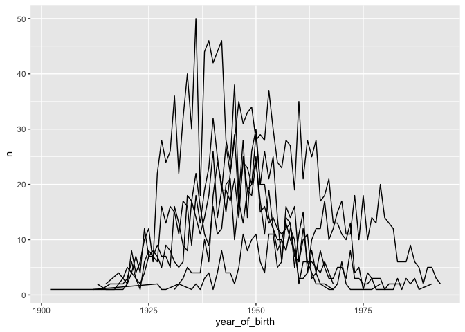
geom_line(aes(x = year_of_birth, y = n))
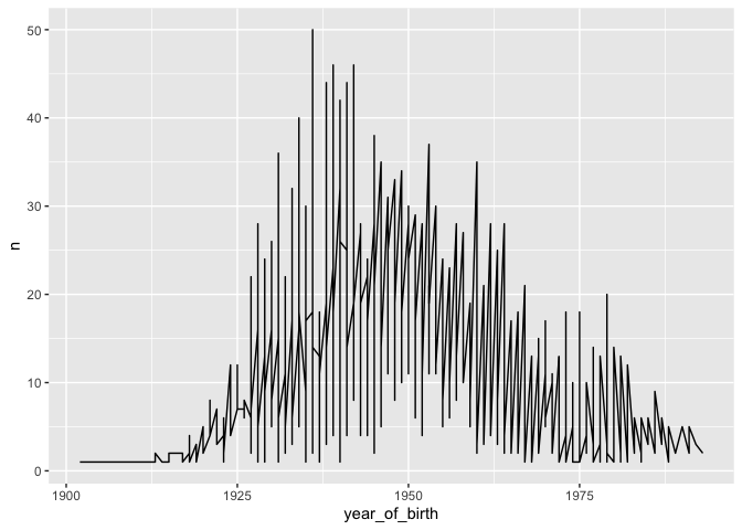
Here, n represents the number of patients born in each year, from the
count table created above. The result isn’t very satisfying, because we
also grouped by disease. We can improve this by plotting each disease on
a separate line, which is more appropriate when there are multiple data
points per year:
# plot one line per cancer type
ggplot(yearly_counts) +
  geom_line(aes(x = year_of_birth, y = n,
                group = disease))
Moreover, we can color each line individually:
# color each line per cancer type
ggplot(yearly_counts) +
  geom_line(aes(x = year_of_birth, y = n, color = disease))
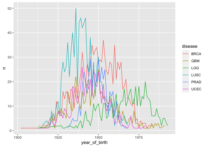
Note that you don’t have to include a separate argument for group =
disease because grouping is assumed by color = disease.
Challenge-line
Create a line plot for year of birth and number of patients with lines representing each gender. Hint: you’ll need to manipulate the
birth_reduceddataset first.
Challenge-dash
How do you show differences in lines using dashes/dots instead of color?
Faceting
So far we’ve been working on building single plots, which can show us two main variables (for the x and y axes) and additional variables using color (and potentially size/shape/etc). Scientific visualizations often need to compare among categories (e.g., control vs various treatments), which is generally clearer if those categories are presented in separate panels. ggplot provides this capacity through faceting.
Let’s revisit the scatterplot we initially created, plotting age at diagnosis by cigarettes per day, with points colored by disease. We add an additional layer to create facets, or separate panels, for a given variable (in this case, the same variable being used to color points):
# use previous scatterplot, but separate panels by disease
ggplot(smoke_complete) +
  geom_point(aes(x = age_at_diagnosis, y = cigarettes_per_day, color = disease)) +
  facet_wrap(vars(disease)) # wraps panels to make a square/rectangular plot
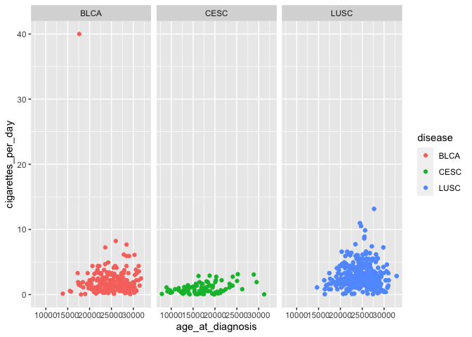
vars is used for faceting in the same way that aes() is used for
mapping: it is used to specify the variable to form facet groups.
facet_wrap determines how many rows and columns of panels are needed
to create the most square-shaped final plot possible. This becomes
useful when there are many more categories:
# add a variable by leaving color but changing panels to other categorical data
ggplot(smoke_complete) +
  geom_point(aes(x = age_at_diagnosis, y = cigarettes_per_day, color = disease)) +
  facet_wrap(vars(tumor_stage))
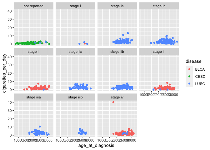
In this case, we’re now visualizing an additional variable (tumor stage), in addition to the original three (age at diagnosis, cigarettes per day, and disease).
If you want to control the specific layout of panels, you can use
facet_grid instead of facet_wrap:
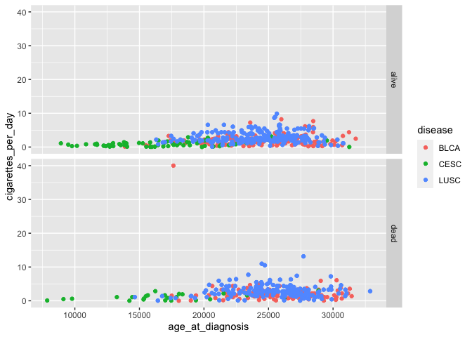
# scatterplots with panels for vital status in one row
ggplot(smoke_complete) +
  geom_point(aes(x = age_at_diagnosis, y = cigarettes_per_day, color = disease)) +
  facet_grid(rows = vars(vital_status))
This method can also plot panels in columns.
We may want to show interactions between two categorical variables, by arranging panels into rows according to one variable and columns according to another:
# add another variable using faceting
ggplot(smoke_complete) +
  geom_point(aes(x = age_at_diagnosis, y = cigarettes_per_day, color = disease)) +
  facet_grid(rows = vars(vital_status), cols = vars(disease)) # arrange plots via variables in rows, columns
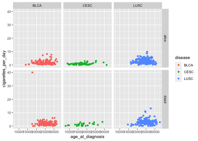
Don’t forget to look at the help documentation (e.g., ?facet_grid) to
learn more about additional ways to customize your plots!
Challenge-panels
Alter your last challenge plot of (birth year by number of patients) to show each gender in separate panels.
Challenge-axis
How do you change axis formatting, like tick marks and lines? Hint: You may want to use Google!
Wrapping up
This material introduced you to ggplot as a tool for data visualization, allowing you to now create publication-quality images using R code. Combined with our previous explorations of the basic principles of R syntax, importing and extracting data with base R, and manipulating data using tidyverse, you should be equipped to continue learning about R on your own and developing code to meet your research needs.
If you are interested in learning more about ggplot: - Documentation for
all ggplot features is available
here. - RStudio also publishes a
ggplot cheat
sheet
that is really handy!
This document is written in R
markdown, which is a method of
formatting text, code, and output to create documents that are sharable
with other people. While this document is intended to serve as a
reference for you to read while typing code into your own script, you
may also be interested in modifying and running code in the original R
markdown file (class4.Rmd in the GitHub repository).
The course materials webpage is available here. Materials for all lessons in this course include:
- Class 1: R syntax, assigning objects, using functions
- Class 2: Data types and structures; slicing and subsetting data
- Class 3: Data manipulation with
dplyr - Class 4: Data visualization in
ggplot2
Extra exercises
Answers to all challenge exercises are available here.
Challenge-improve
Improve one of the plots previously created today, by changing thickness of lines, name of legend, or color palette (http://www.cookbook-r.com/Graphs/Colors_(ggplot2)/)