Lecture 14 – Principles of Data Visualization
Arvind R. Subramaniam
Assistant Member
Basic Sciences Division and Computational Biology Program
Fred Hutchinson Cancer Research Center
Learning Objectives
- Know general dos and donts of data visualization
- Know about different types of data visualization
- Effective strategies for visualization
Useful reference
(Source of many figures in this lecture)
Fundamentals of Data Visualization by Claus O. Wilke
Goals of Visualization
- Show experimental design and results
- Show relationships among variables
- Range and interval of a variable
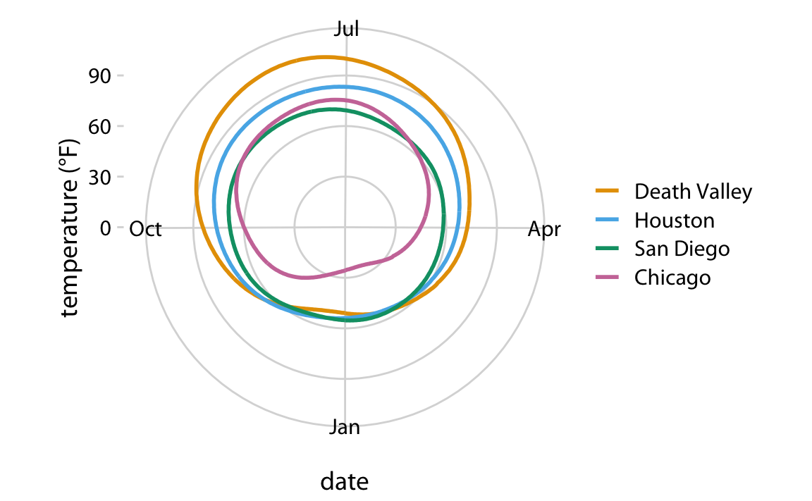
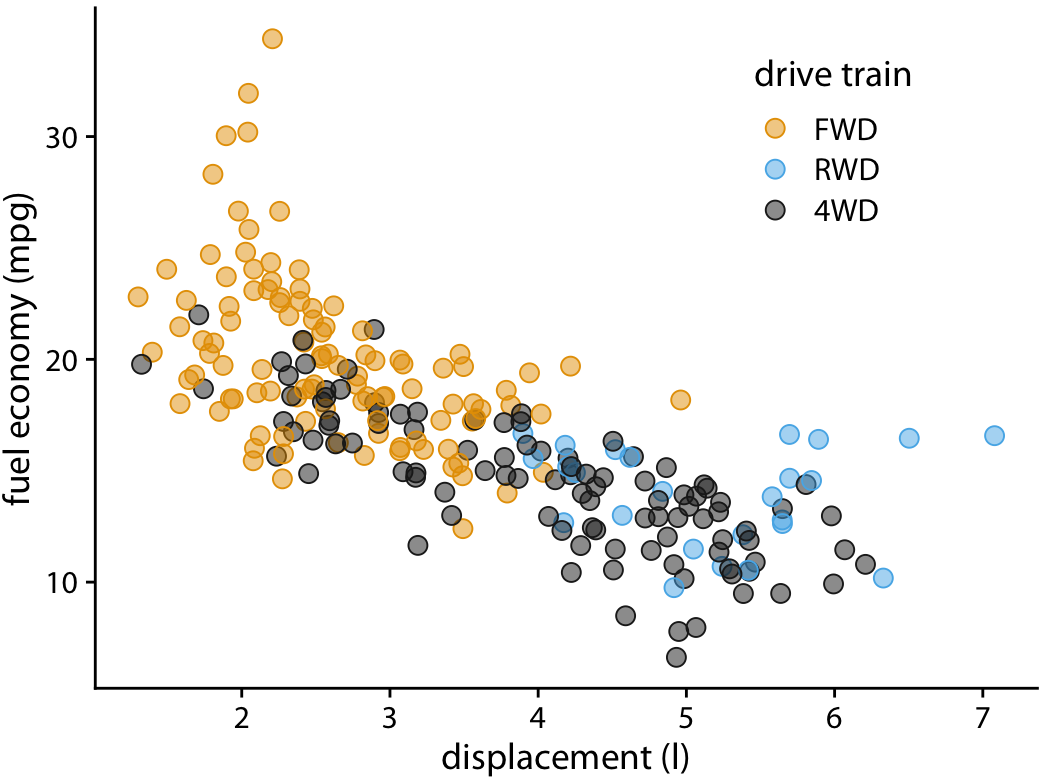
Same data can be visualized very differently
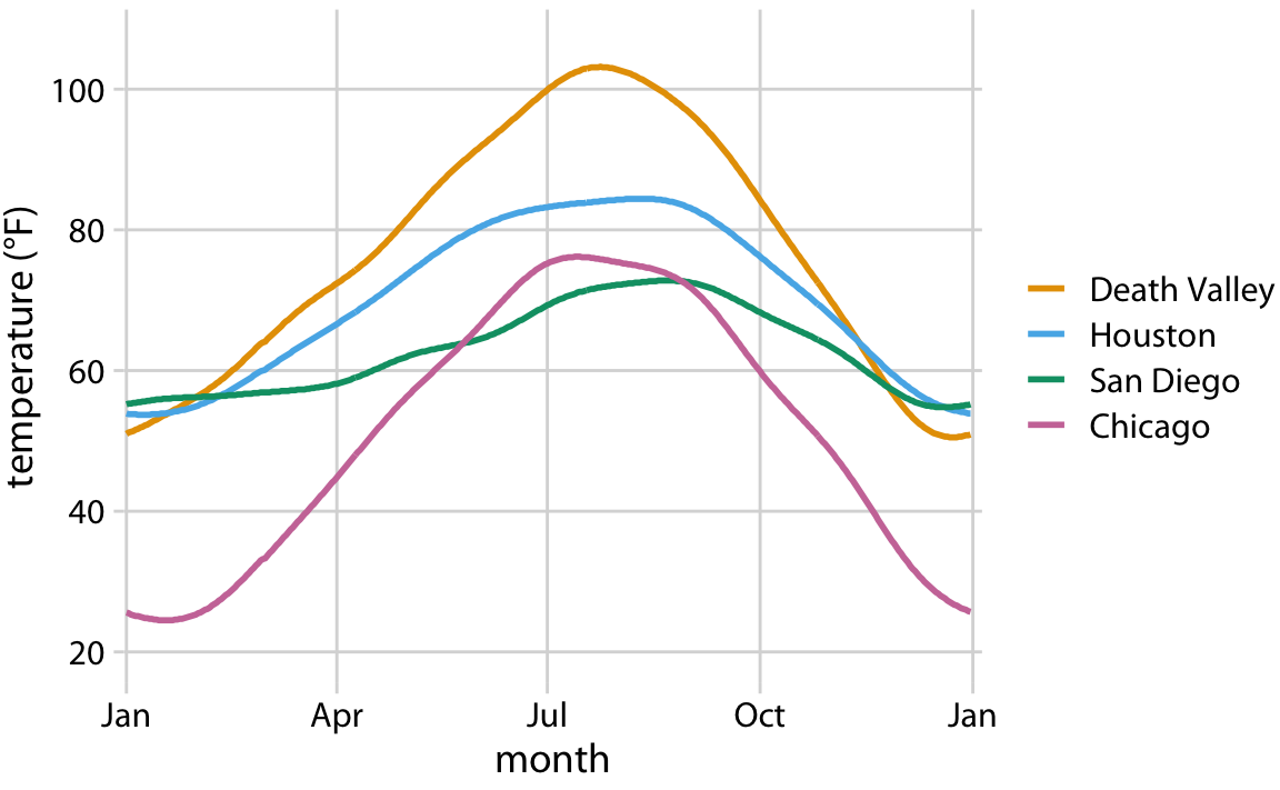
Same data can be visualized very differently
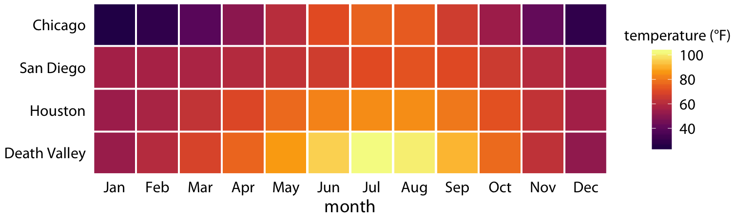
Same data can be visualized very differently
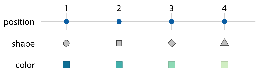
Elements of a visualization
- Aesthetics
- Scales
- Labeling
- Exporting
Aesthetics
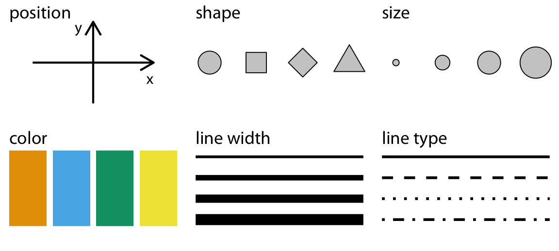
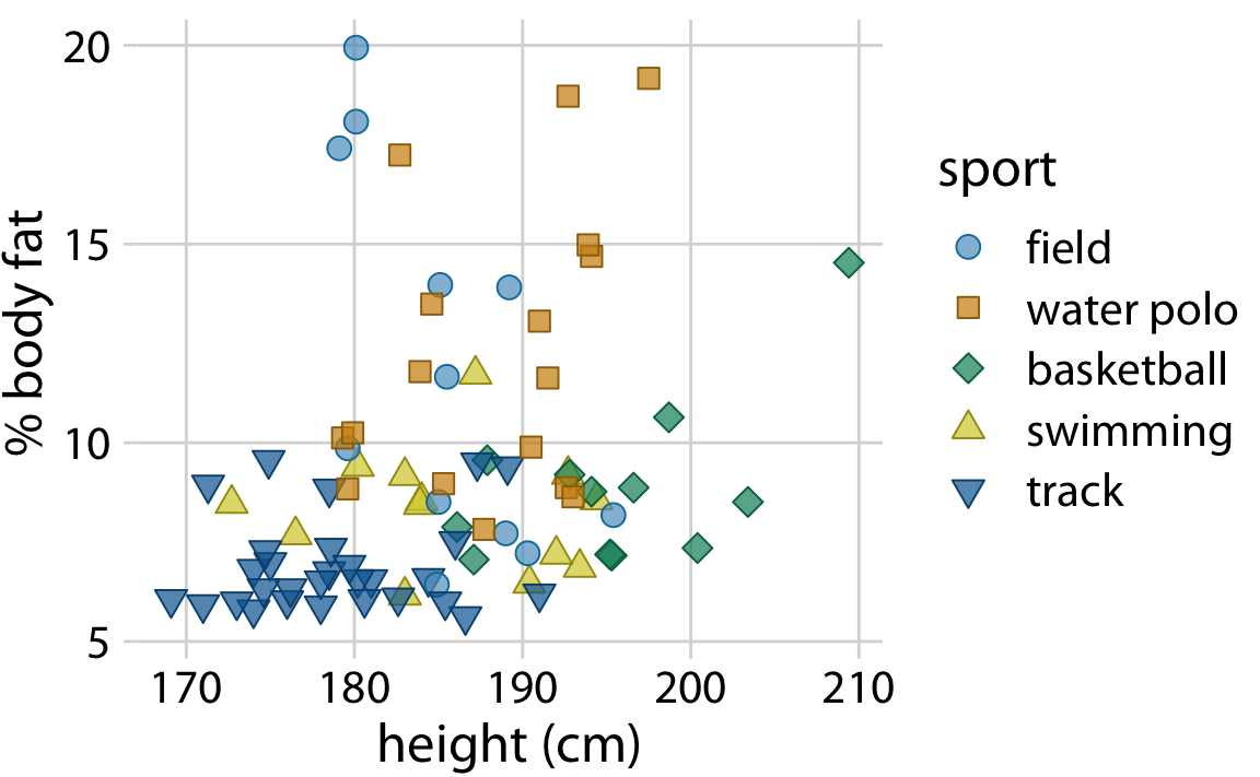
How do you pick the type of aesthetics?
- How many variables and data points do you want to show?
- Is your data continuous or discrete?
- Is there a natural order of discrete variables?
Scales
Log axes suitable for P-values
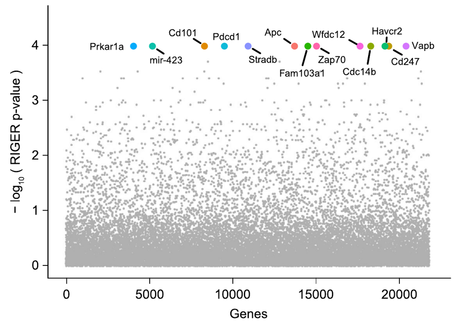
Log axes suitable for fold-changes
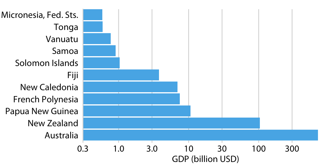
Log-log plots are common in biology
Labels
If you take away only one single lesson from this book, make it this one: Pay attention to your axis labels, axis tick labels, and other assorted plot annotations. Chances are they are too small. In my experience, nearly all plot libraries and graphing softwares have poor defaults. If you use the default values, you’re almost certainly making a poor choice.
Cannot-read labels
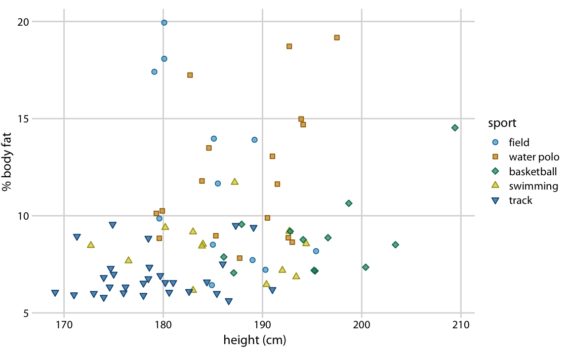
Small labels
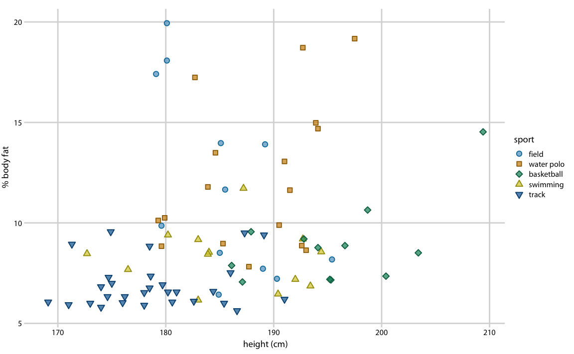
Appropriately-sized labels
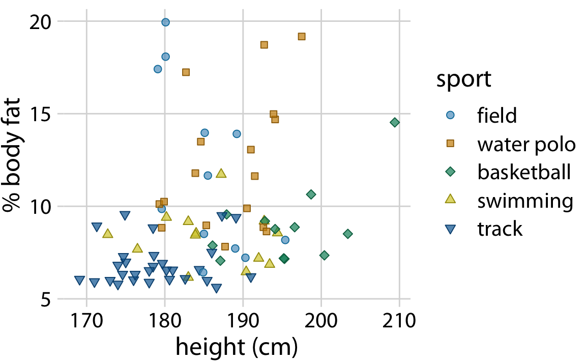
Too-big labels
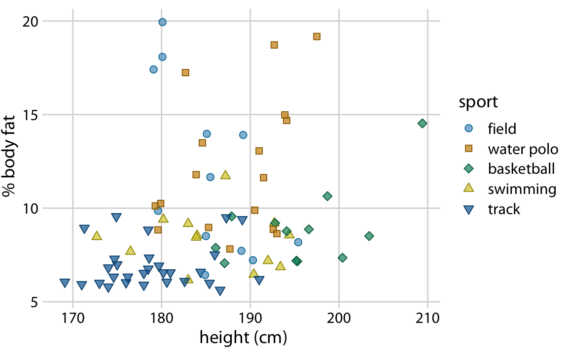
Seemingly big but ok labels
Exporting
- Finalize the figure within R as much as possible.
- Use vector graphics for saving: PDF or SVG.
- Inkscape – useful open source vector graphics program for editing figures.
- Make sure that text can be edited when you open the image.
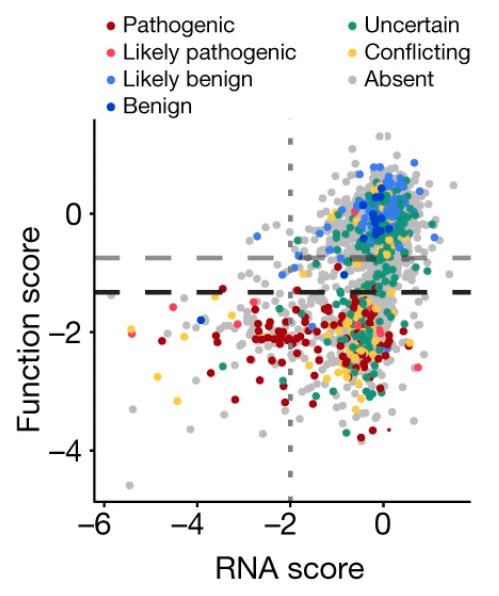
Colors
Why use colors?
- As a tool to distinguish
- To represent data values
Color to distinguish groups
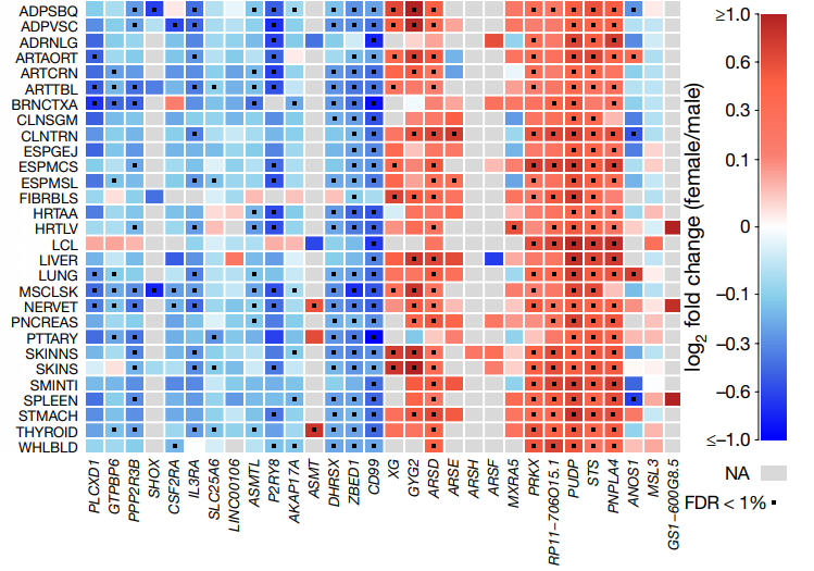
Color to represent quantitative data
How to choose colors
Avoid using many colors in a single graph
How to choose colors

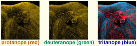
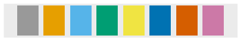
Use colorblind-friendly palettes
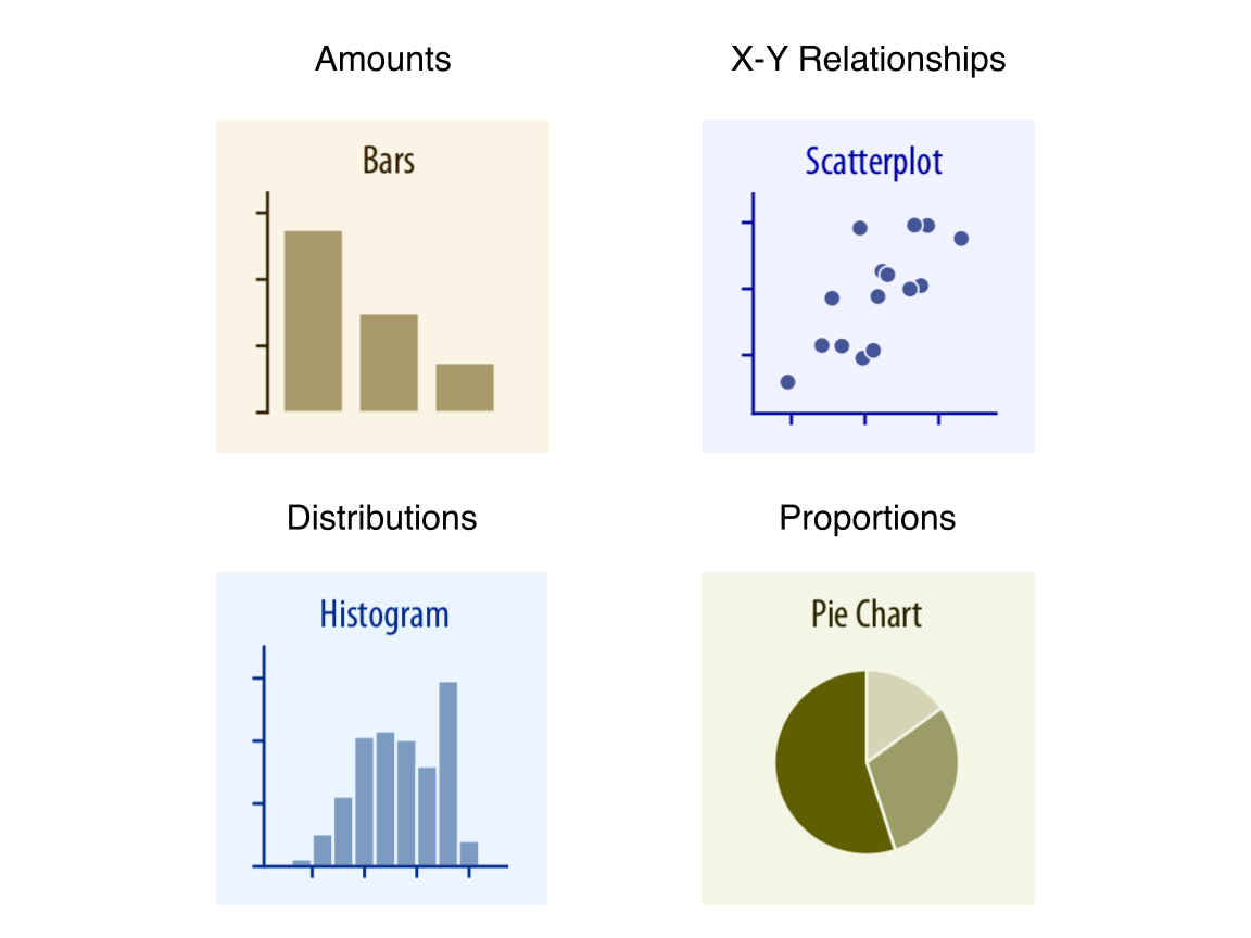
Different types of data that we want to visualize
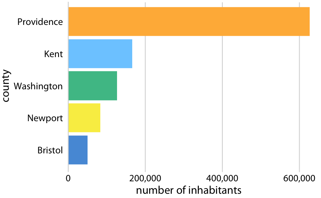
| Amounts |
| X-Y Relationships |
| Distributions |
| Proportions |
Common types of data visualizations
Visualizing uncertainty
| Standard Error |
| Confidence Bands |
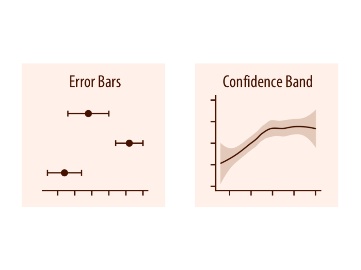
Visualizing uncertainty
| Standard Error |
| Confidence Bands |
Standard deviation or standard error?
Standard deviation does not decrease with more measurements.
Yes or No?
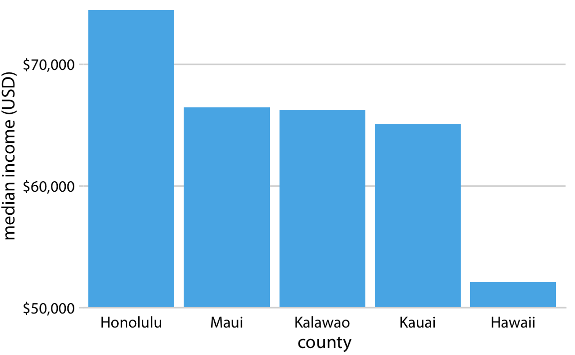
Linear scales should begin at 0.
Yes or No?
Bar areas are not proportional to value.
Principle of proportional ink
Yes or No?
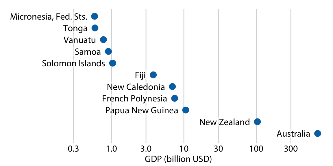
Log data values are best shown as points.
Which is better – pie or bar?
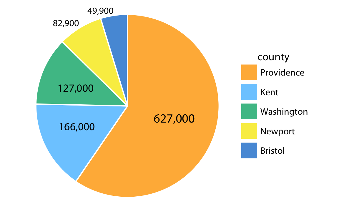
Which is better – pie or bar?
Bars are more accurately perceived than areas.
Yes or No?
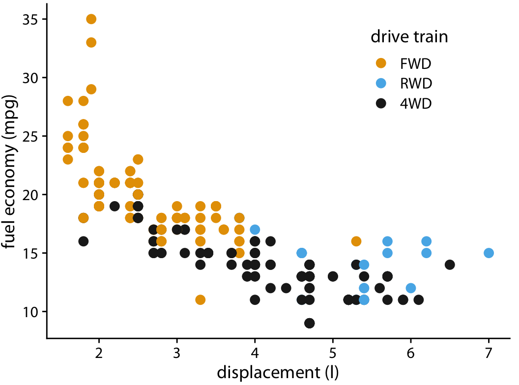
Overlapping points can be hidden.
Yes or No?
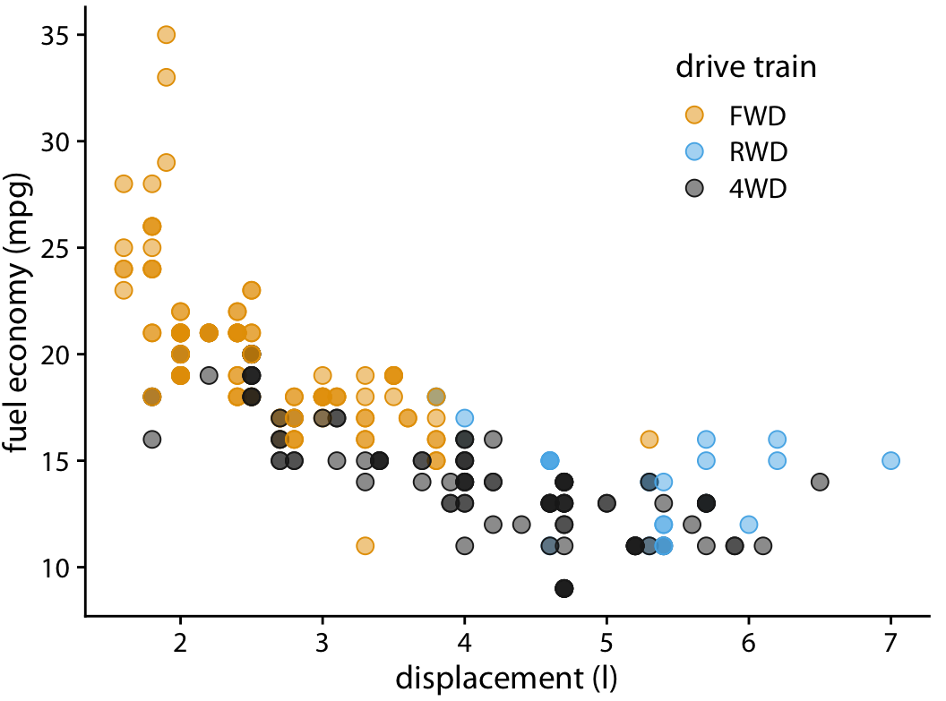
Make points semi-transparent.
Yes or No?
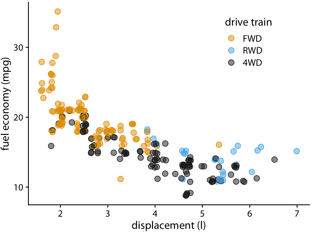
Slightly jitter points along the direction of overlap.
Yes or No?
But too much jittering can be misleading.
Yes or No?
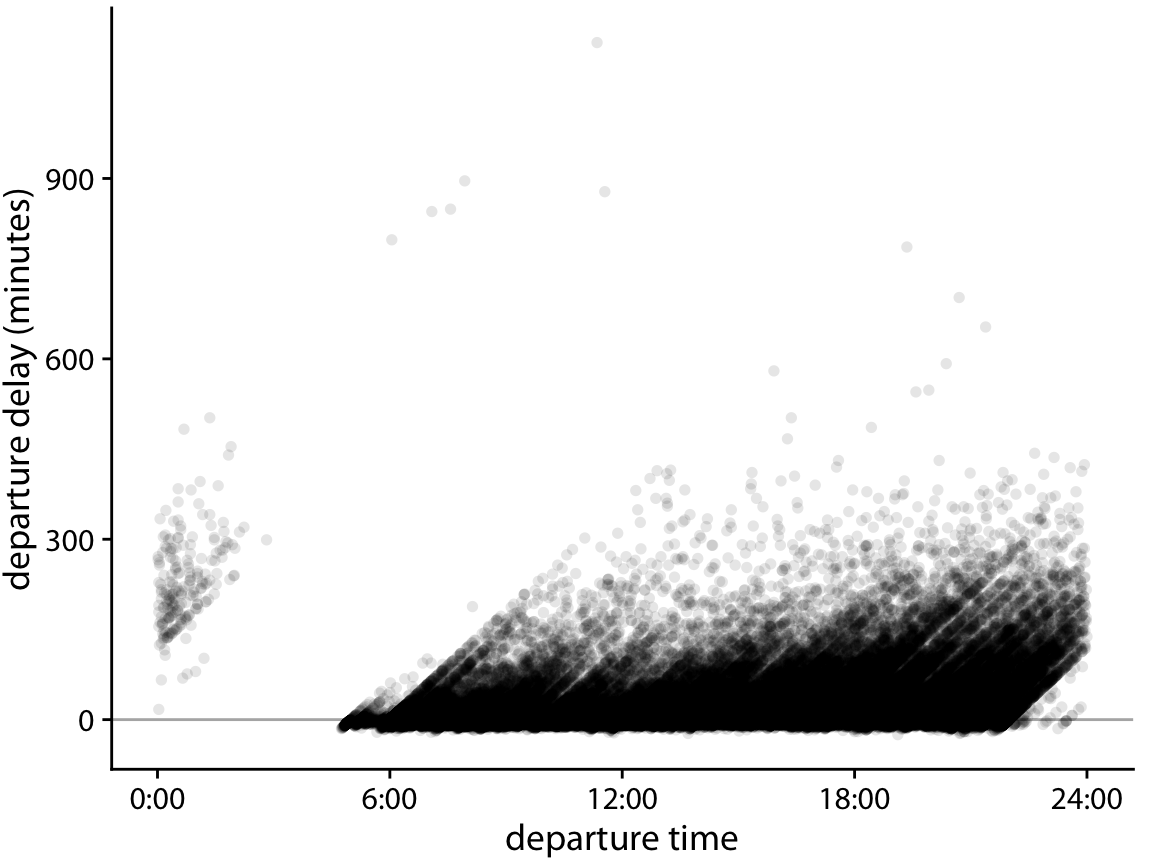
Neither transparency nor jittering will help when data density is too high.
Yes or No?
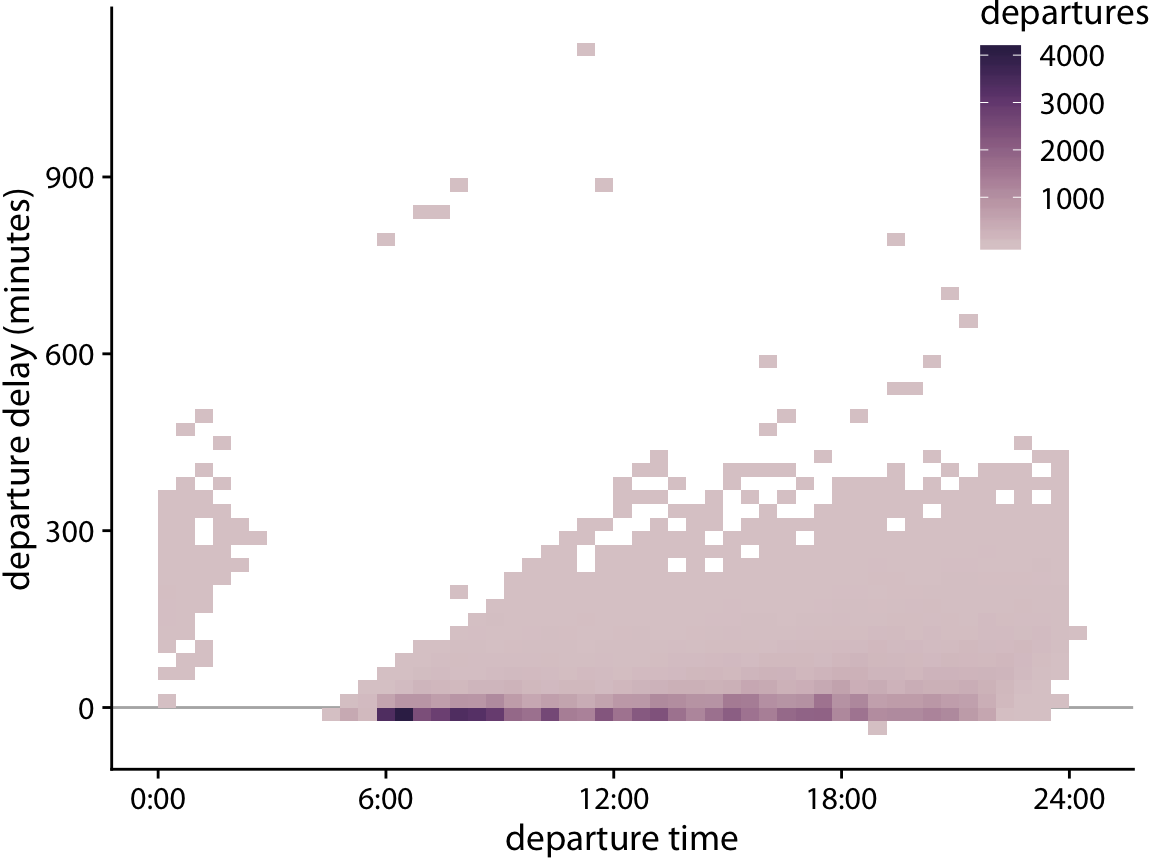
Binned 2D histograms is a good solution.
Yes or No?
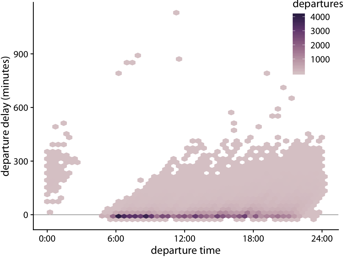
Hexagonal bins are slightly more accurate.
Yes or No?
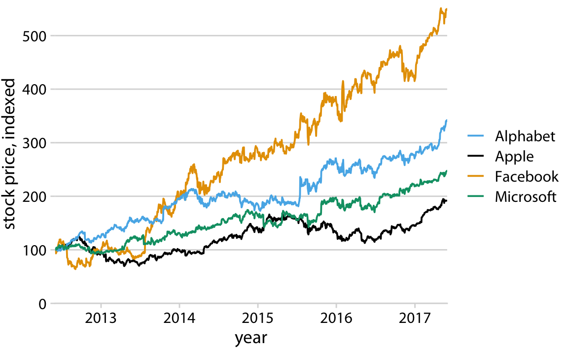
Legend order does not match plot order.
Yes or No?
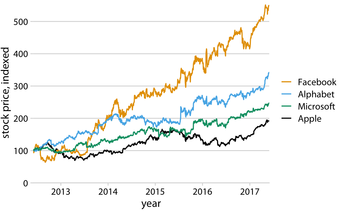
Legend order matches plot order.
Yes or No?
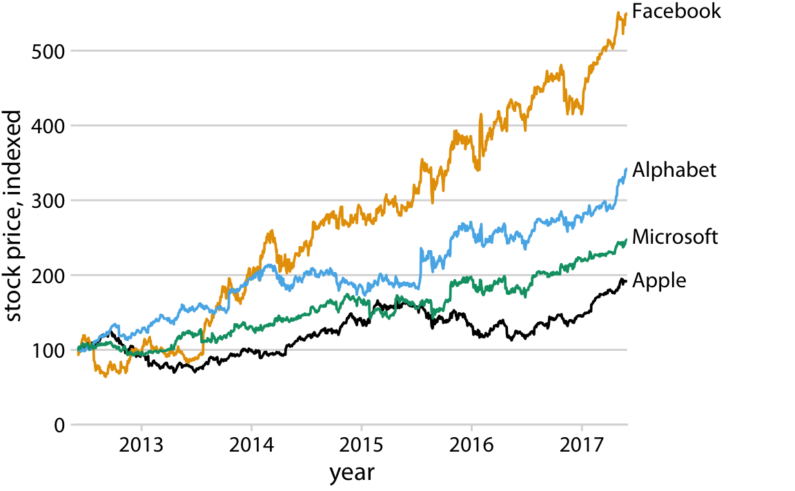
Pick direct labeling over legend.