tfcb_2020
Lecture 14: In-class exercises
PUT YOUR NAME HERE
11/12/2020
Load packages you need
library(tidyverse)
## ── Attaching packages ─────────────────────────────────────── tidyverse 1.3.0 ──

## ✔ ggplot2 3.3.2     ✔ purrr   0.3.4
## ✔ tibble  3.0.3     ✔ dplyr   1.0.2
## ✔ tidyr   1.1.2     ✔ stringr 1.4.0
## ✔ readr   1.3.1     ✔ forcats 0.5.0

## ── Conflicts ────────────────────────────────────────── tidyverse_conflicts() ──
## ✖ dplyr::filter() masks stats::filter()
## ✖ dplyr::lag()    masks stats::lag()
Read in example dataset 5 in the data subfolder and store the result in flow_data variable
Note that the first line is a comment that mentions the column names. This annoying structure is typical of datasets that you might receive from someone else. Look at the documentation of read_csv and figure out how to skip commented out lines and assign your own column names.
flow_data <- read_csv("data/example_dataset_5.csv", col_names = c("strain", "yfp", "rfp", "replicate"), comment = "#") %>%
  print()
## Parsed with column specification:
## cols(
##   strain = col_character(),
##   yfp = col_double(),
##   rfp = col_double(),
##   replicate = col_double()
## )

## # A tibble: 74 x 4
##    strain    yfp   rfp replicate
##    <chr>   <dbl> <dbl>     <dbl>
##  1 schp677  4123 20661         1
##  2 schp678  4550 21437         1
##  3 schp675  3880 21323         1
##  4 schp676  2863 20668         1
##  5 schp687  4767 20995         1
##  6 schp688  1274 20927         1
##  7 schp679  2605 20840         1
##  8 schp680  1175 20902         1
##  9 schp681  3861 20659         1
## 10 schp683  9949 25406         1
## # … with 64 more rows
Read in example dataset 3 in the data subfolder which contains the annotations for the above table and store it in a variable annotations
annotations <- read_tsv("data/example_dataset_3.tsv") %>%
  print()
## Parsed with column specification:
## cols(
##   strain = col_character(),
##   insert_sequence = col_character(),
##   kozak_region = col_character()
## )

## # A tibble: 17 x 3
##    strain  insert_sequence kozak_region
##    <chr>   <chr>           <chr>
##  1 schp674 10×AAG          G
##  2 schp675 10×AAG          B
##  3 schp676 10×AAG          F
##  4 schp677 10×AAG          E
##  5 schp678 10×AAG          D
##  6 schp679 10×AAG          A
##  7 schp680 10×AAG          H
##  8 schp681 10×AAG          C
##  9 schp683 10×AGA          G
## 10 schp684 10×AGA          B
## 11 schp685 10×AGA          F
## 12 schp686 10×AGA          E
## 13 schp687 10×AGA          D
## 14 schp688 10×AGA          A
## 15 schp689 10×AGA          H
## 16 schp690 10×AGA          C
## 17 control <NA>            <NA>
Join the two tables above and assign to a new variable data
data <- inner_join(flow_data, annotations, by = "strain") %>%
  print()
## # A tibble: 74 x 6
##    strain    yfp   rfp replicate insert_sequence kozak_region
##    <chr>   <dbl> <dbl>     <dbl> <chr>           <chr>
##  1 schp677  4123 20661         1 10×AAG          E
##  2 schp678  4550 21437         1 10×AAG          D
##  3 schp675  3880 21323         1 10×AAG          B
##  4 schp676  2863 20668         1 10×AAG          F
##  5 schp687  4767 20995         1 10×AGA          D
##  6 schp688  1274 20927         1 10×AGA          A
##  7 schp679  2605 20840         1 10×AAG          A
##  8 schp680  1175 20902         1 10×AAG          H
##  9 schp681  3861 20659         1 10×AAG          C
## 10 schp683  9949 25406         1 10×AGA          G
## # … with 64 more rows
Create a new column ratio containing ratio of YFP and RFP signals for each strain replicate.
Store the result in the same data variable.
data <- data %>%
  mutate(ratio = yfp / rfp) %>%
  print()
## # A tibble: 74 x 7
##    strain    yfp   rfp replicate insert_sequence kozak_region  ratio
##    <chr>   <dbl> <dbl>     <dbl> <chr>           <chr>         <dbl>
##  1 schp677  4123 20661         1 10×AAG          E            0.200
##  2 schp678  4550 21437         1 10×AAG          D            0.212
##  3 schp675  3880 21323         1 10×AAG          B            0.182
##  4 schp676  2863 20668         1 10×AAG          F            0.139
##  5 schp687  4767 20995         1 10×AGA          D            0.227
##  6 schp688  1274 20927         1 10×AGA          A            0.0609
##  7 schp679  2605 20840         1 10×AAG          A            0.125
##  8 schp680  1175 20902         1 10×AAG          H            0.0562
##  9 schp681  3861 20659         1 10×AAG          C            0.187
## 10 schp683  9949 25406         1 10×AGA          G            0.392
## # … with 64 more rows
Calculate the mean and standard deviation of the YFP-RFP ratio across all replicates for each strain.
To do the above, create new summary columns mean_ratio and std_ratio after grouping all replicates.
Assign the result to avg_data variable.
avg_data <- data %>%
  group_by(strain) %>%
  summarize(mean_ratio = mean(ratio), std_ratio = sd(ratio)) %>%
  print()
## `summarise()` ungrouping output (override with `.groups` argument)

## # A tibble: 16 x 3
##    strain  mean_ratio std_ratio
##    <chr>        <dbl>     <dbl>
##  1 schp674     0.0625  0.000640
##  2 schp675     0.181   0.00887
##  3 schp676     0.131   0.0118
##  4 schp677     0.193   0.00747
##  5 schp678     0.212   0.00223
##  6 schp679     0.128   0.0125
##  7 schp680     0.0578  0.00256
##  8 schp681     0.183   0.00520
##  9 schp683     0.392   0.0246
## 10 schp684     0.160   0.00517
## 11 schp685     0.322   0.0124
## 12 schp686     0.236   0.00584
## 13 schp687     0.223   0.00523
## 14 schp688     0.0841  0.0163
## 15 schp689     0.381   0.0311
## 16 schp690     0.172   0.00442
What happened to the annotations? Can you join them back with avg_data?
avg_data <- inner_join(avg_data, annotations, by = "strain") %>%
  print()
## # A tibble: 16 x 5
##    strain  mean_ratio std_ratio insert_sequence kozak_region
##    <chr>        <dbl>     <dbl> <chr>           <chr>
##  1 schp674     0.0625  0.000640 10×AAG          G
##  2 schp675     0.181   0.00887  10×AAG          B
##  3 schp676     0.131   0.0118   10×AAG          F
##  4 schp677     0.193   0.00747  10×AAG          E
##  5 schp678     0.212   0.00223  10×AAG          D
##  6 schp679     0.128   0.0125   10×AAG          A
##  7 schp680     0.0578  0.00256  10×AAG          H
##  8 schp681     0.183   0.00520  10×AAG          C
##  9 schp683     0.392   0.0246   10×AGA          G
## 10 schp684     0.160   0.00517  10×AGA          B
## 11 schp685     0.322   0.0124   10×AGA          F
## 12 schp686     0.236   0.00584  10×AGA          E
## 13 schp687     0.223   0.00523  10×AGA          D
## 14 schp688     0.0841  0.0163   10×AGA          A
## 15 schp689     0.381   0.0311   10×AGA          H
## 16 schp690     0.172   0.00442  10×AGA          C
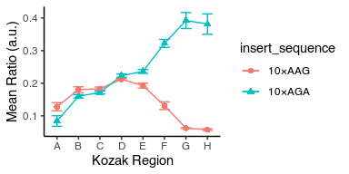
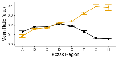
Plot the mean and standard deviation of the YFP-RFP ratio as a function of the Kozak region.
Display the result as a point graph and a line graph with error bars around the mean.
Give the insert_sequences different shapes and colors.
Can you make the markers twice their default size?
Can you make the error bars half as wide as their default width?
Store the result as a PDF file named demo_plot.pdf in figures subfolder.
avg_data %>%
ggplot(aes(x = kozak_region, y = mean_ratio, color = insert_sequence, shape = insert_sequence, group = insert_sequence)) +
  geom_point(size = 2) +
  geom_line() +
  geom_errorbar(aes(ymin = mean_ratio - std_ratio, ymax = mean_ratio  + std_ratio), width = 0.5)
ggsave("figures/example_plot.pdf")
## Saving 4 x 3 in image
We start from where we left off last week in Lecture 13
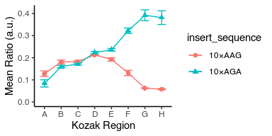
Modify the above plot to change X-axis label to “Kozak Region” and Y-axis label to “Mean Ratio (a.u.)”
avg_data %>%
ggplot(aes(x = kozak_region, y = mean_ratio, color = insert_sequence, shape = insert_sequence, group = insert_sequence)) +
  geom_point(size = 2) +
  geom_line() +
  geom_errorbar(aes(ymin = mean_ratio - std_ratio, ymax = mean_ratio  + std_ratio), width = 0.5) +
  labs(x = "Kozak Region", y = "Mean Ratio (a.u.)")
Find and use another standard ggplot2 theme that converts the grey backgound to white and without grids
avg_data %>%
ggplot(aes(x = kozak_region, y = mean_ratio, color = insert_sequence, shape = insert_sequence, group = insert_sequence)) +
  geom_point(size = 2) +
  geom_line() +
  geom_errorbar(aes(ymin = mean_ratio - std_ratio, ymax = mean_ratio  + std_ratio), width = 0.5) +
  labs(x = "Kozak Region", y = "Mean Ratio (a.u.)") +
  theme_classic()
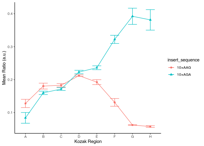
Adjust figure size to have proportional ink
avg_data %>%
ggplot(aes(x = kozak_region, y = mean_ratio, color = insert_sequence, shape = insert_sequence, group = insert_sequence)) +
  geom_point(size = 2) +
  geom_line() +
  geom_errorbar(aes(ymin = mean_ratio - std_ratio, ymax = mean_ratio  + std_ratio), width = 0.5) +
  labs(x = "Kozak Region", y = "Mean Ratio (a.u.)") +
  theme_classic()
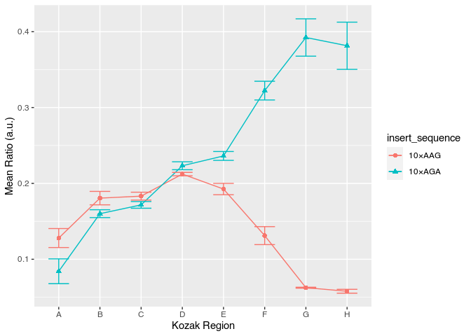
Adjust the bottom of Y-scale to start from zero
avg_data %>%
ggplot(aes(x = kozak_region, y = mean_ratio, color = insert_sequence, shape = insert_sequence, group = insert_sequence)) +
  geom_point(size = 2) +
  geom_line() +
  geom_errorbar(aes(ymin = mean_ratio - std_ratio, ymax = mean_ratio  + std_ratio), width = 0.5) +
  labs(x = "Kozak Region", y = "Mean Ratio (a.u.)") +
  theme_classic() +
  scale_y_continuous(limits = c(0, NA))
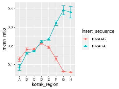
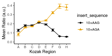
Change colors to be color-blind friendly
You have two options:
- Install the
ggthemespackage and use thescale_color_colorblindfunction from there. - Set the color manually to one of the hex colors in
c("#999999", "#E69F00", "#56B4E9", "#009E73", "#F0E442", "#0072B2", "#D55E00", "#CC79A7").
avg_data %>%
ggplot(aes(x = kozak_region, y = mean_ratio, color = insert_sequence, shape = insert_sequence, group = insert_sequence)) +
  geom_point(size = 2) +
  geom_line() +
  geom_errorbar(aes(ymin = mean_ratio - std_ratio, ymax = mean_ratio  + std_ratio), width = 0.5) +
  labs(x = "Kozak Region", y = "Mean Ratio (a.u.)") +
  theme_classic() +
  scale_y_continuous(limits = c(0, NA)) +
  ggthemes::scale_color_colorblind()
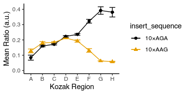
Notice that the legend is in the opposite order to the plot lines. Can you change their order to match?
Hint: use mutate with fct_reorder and .desc = TRUE to modify the insert_sequence column before feeding it to ggplot.
avg_data %>%
  mutate(insert_sequence = fct_reorder(insert_sequence, mean_ratio, .desc = T)) %>%
  ggplot(aes(x = kozak_region, y = mean_ratio, color = insert_sequence, shape = insert_sequence, group = insert_sequence)) +
  geom_point(size = 2) +
  geom_line() +
  geom_errorbar(aes(ymin = mean_ratio - std_ratio, ymax = mean_ratio  + std_ratio), width = 0.5) +
  labs(x = "Kozak Region", y = "Mean Ratio (a.u.)") +
  theme_classic() +
  scale_y_continuous(limits = c(0, NA)) +
  ggthemes::scale_color_colorblind()
Can you remove the legend altogether before we proceed to the next step?
avg_data %>%
  ggplot(aes(x = kozak_region, y = mean_ratio, color = insert_sequence, shape = insert_sequence, group = insert_sequence)) +
  geom_point(size = 2) +
  geom_line() +
  geom_errorbar(aes(ymin = mean_ratio - std_ratio, ymax = mean_ratio  + std_ratio), width = 0.5) +
  labs(x = "Kozak Region", y = "Mean Ratio (a.u.)") +
  theme_classic() +
  theme(legend.position = "none") +
  scale_y_continuous(limits = c(0, NA)) +
  ggthemes::scale_color_colorblind()
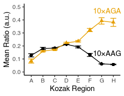
Put the insert_sequence label physically close to each line.
Hint: Use geom_text with label aesthetic and the data argument modified to include only the one data point for each insert_sequence from avg_data and placing it.
Note that you will have to adjust mean_ratio so that the text is not on top of your data.
Note that you can play with hjust argument of geom_text to tweak horizontal placement.
Adjust the plot dimensions so that it looks ‘nice’.
avg_data %>%
  ggplot(aes(x = kozak_region, y = mean_ratio, color = insert_sequence, shape = insert_sequence, group = insert_sequence)) +
  geom_point(size = 2) +
  geom_line() +
  geom_text(aes(label = insert_sequence), data = avg_data %>% filter(kozak_region == "G") %>% mutate(mean_ratio = mean_ratio + 0.08), hjust = 0.3) +
  geom_errorbar(aes(ymin = mean_ratio - std_ratio, ymax = mean_ratio  + std_ratio), width = 0.5) +
  labs(x = "Kozak Region", y = "Mean Ratio (a.u.)") +
  theme_classic() +
  theme(legend.position = "none") +
  scale_y_continuous(limits = c(0, 0.5)) +
  ggthemes::scale_color_colorblind()