Lecture 12 – Visualize data using R / ggplot2
Arvind R. Subramaniam
Assistant Member
Basic Sciences Division and Computational Biology Program
Fred Hutchinson Cancer Research Center
What you will learn over the next 3 lectures
Loading, Transforming, Visualizing Tabular Data using Tidyverse packages
Principles of Data Visualization (see book)
Example Datasets
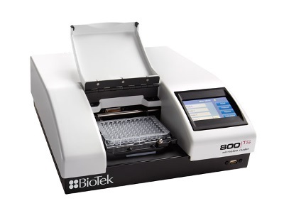
Plate Reader Assay
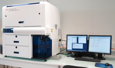
Flow Cytometry
Raw Flow Cytometry Data
| FSC.A | SSC.A | FITC.A | PE.Texas.Red.A | Time |
|---|---|---|---|---|
| 79033 | 69338 | 9173 | 18690 | 3.02 |
| 101336 | 87574 | 13184 | 29886 | 3.04 |
| 51737 | 56161 | 3083 | 18324 | 3.06 |
| 79904 | 45085 | 9957 | 18099 | 3.08 |
| 124491 | 97305 | 15739 | 28730 | 3.09 |
| 54359 | 45015 | 6175 | 11918 | 3.11 |
| 64615 | 88989 | 11907 | 32413 | 3.13 |
| 109592 | 64132 | 12561 | 18824 | 3.15 |
| 58503 | 116384 | 11591 | 27629 | 3.19 |
| 38634 | 51511 | 7200 | 21930 | 3.21 |
5 cols × 2,720,000 rows
Flow Cytometry Analysis Using Tidyverse
Tidyverse Functions for Working with Tabular Data
| Import/Export | Visualize | Transform |
|---|---|---|
read_tsv |
geom_point |
select |
write_tsv |
geom_line |
filter |
facet_grid |
arrange |
|
mutate |
||
join |
||
group_by |
||
summarize |
Use TSV and CSV file formats for tabular data
Tab-Separated Values:
strain   mean_yfp  mean_rfp  mean_ratio  se_ratio  insert_sequence  kozak_region
schp674      1270     20316       0.561     0.004  10×AAG           CAAA
schp675      3687     20438       1.621     0.036  10×AAG           CCGC
schp676      2657     20223       1.177     0.048  10×AAG           CCAA
schp677      3967     20604       1.728      0.03  10×AAG           CCAC
Comma-Separated Values:
strain,mean_yfp,mean_rfp,mean_ratio,se_ratio,insert_sequence,kozak_region
schp674,1270,20316,0.561,0.004,10×AAG,CAAA
schp675,3687,20438,1.621,0.036,10×AAG,CCGC
schp676,2657,20223,1.177,0.048,10×AAG,CCAA
schp677,3967,20604,1.728,0.03,10×AAG,CCAC
Reading tabular data into R
library(tidyverse)

data <- read_tsv("data/example_dataset_1.tsv")
Read tabular data into a DataFrame (tibble)
library(tidyverse)

data <- read_tsv("data/example_dataset_1.tsv")

print(data, n = 5)
# A tibble: 16 x 7
  strain  mean_yfp mean_rfp mean_ratio se_ratio insert_sequence kozak_region
  <chr>      <dbl>    <dbl>      <dbl>    <dbl> <chr>           <chr>
1 schp688     1748    20754      0.755    0.066 10×AGA          A
2 schp684     3294    20585      1.44     0.021 10×AGA          B
3 schp690     3535    20593      1.54     0.018 10×AGA          C
4 schp687     4658    20860      2.00     0.021 10×AGA          D
5 schp686     5000    21171      2.12     0.023 10×AGA          E
# … with 11 more rows
Comment your code
# library to work with tabular data
library(tidyverse)

# read the tsv file into a tibble and
# assign it to the 'data' variable
data <- read_tsv("data/example_dataset_1.tsv")

# display the contents of 'data'
print(data, n = 5)
Plotting a point graph
ggplot(data, aes(x = kozak_region,
                 y = mean_ratio)) +
  geom_point()
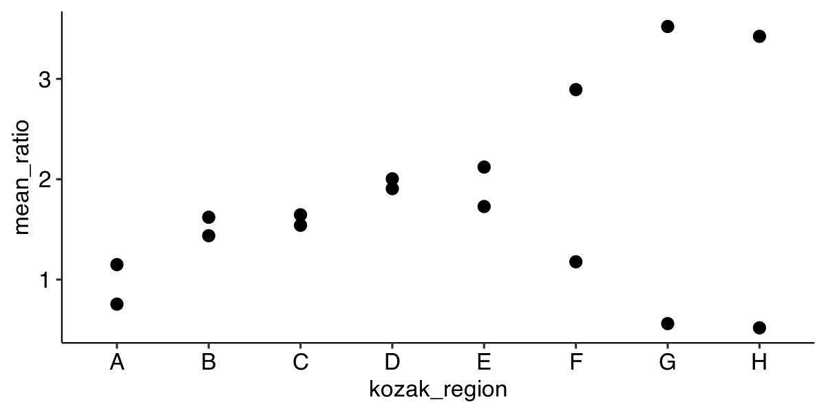
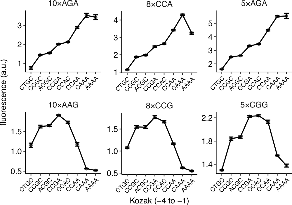
How do we show multiple experimental parameters?
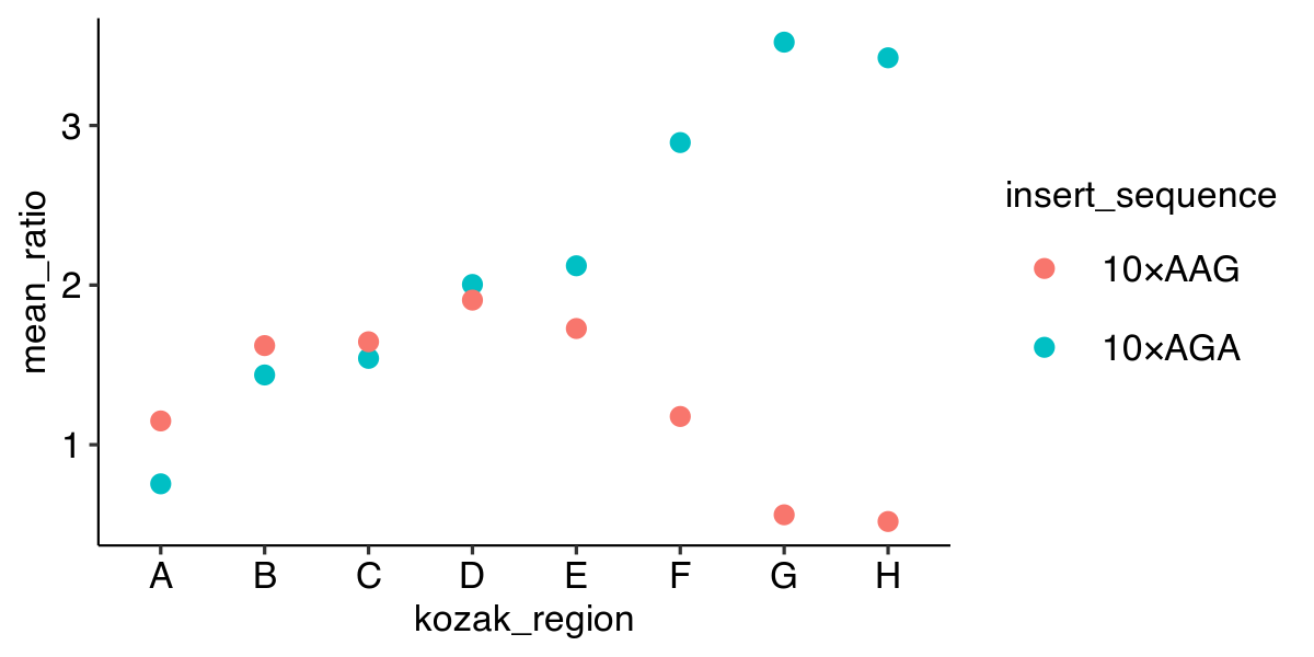
| strain | mean_ratio | insert_sequence | kozak_region |
|---|---|---|---|
| schp688 | 0.755 | 10×AGA | A |
| schp684 | 1.437 | 10×AGA | B |
| schp690 | 1.541 | 10×AGA | C |
| schp687 | 2.004 | 10×AGA | D |
| schp686 | 2.121 | 10×AGA | E |
| schp685 | 2.893 | 10×AGA | F |
| schp683 | 3.522 | 10×AGA | G |
| schp689 | 3.424 | 10×AGA | H |
| schp679 | 1.149 | 10×AAG | A |
| schp675 | 1.621 | 10×AAG | B |
| schp681 | 1.645 | 10×AAG | C |
| schp678 | 1.906 | 10×AAG | D |
| schp677 | 1.728 | 10×AAG | E |
| schp676 | 1.177 | 10×AAG | F |
| schp674 | 0.561 | 10×AAG | G |
| schp680 | 0.519 | 10×AAG | H |
Plotting a point graph with color
ggplot(data, aes(x = kozak_region,
                 y = mean_ratio,
                 color = insert_sequence)) +
  geom_point()
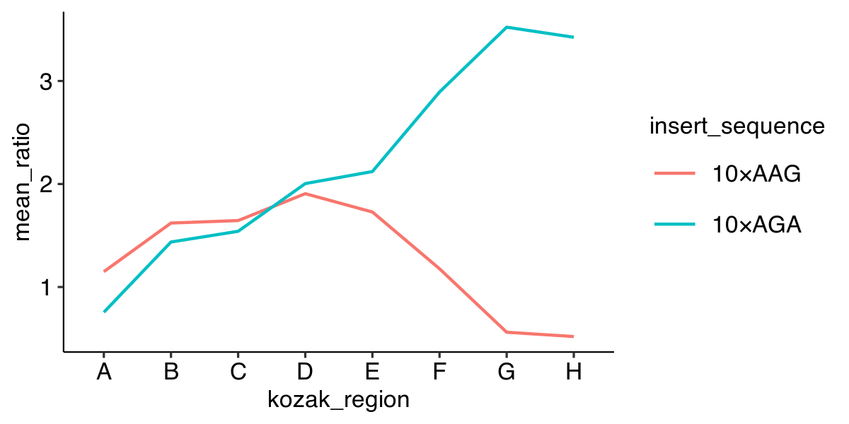
Plotting a line graph
ggplot(data, aes(x = kozak_region,
                 y = mean_ratio,
                 color = insert_sequence,
                 group = insert_sequence)) +
  geom_line()
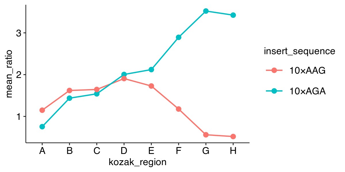
Plotting point and line graphs
ggplot(data, aes(x = kozak_region,
                 y = mean_ratio,
                 color = insert_sequence,
                 group = insert_sequence)) +
  geom_line() +
  geom_point()
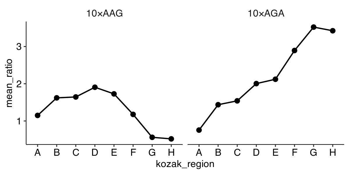
‘Faceting’ – Plotting in multiple panels
ggplot(data, aes(x = kozak_region,
                 y = mean_ratio,
                 group = insert_sequence)) +
  geom_line() +
  geom_point() +
  facet_grid(~ insert_sequence)
Play time!
- Get used to the RStudio interface.
- Plot data and customize appearance.
- Learn how to "Knit" RMarkdown files.
- Learn more at https://ggplot2.tidyverse.org.