Introduction to R, Class 4: Solutions
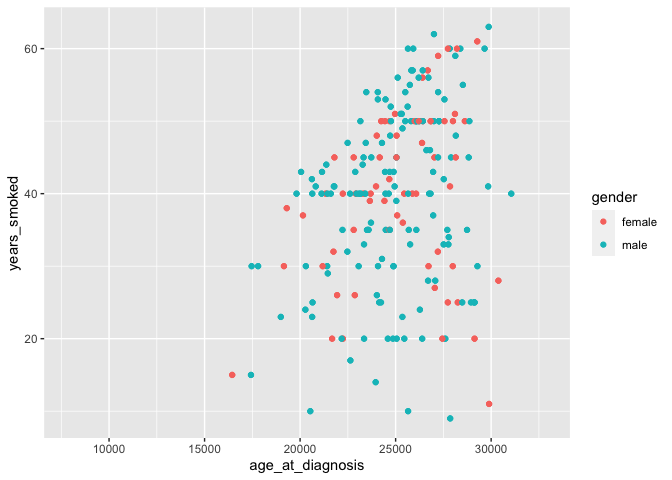
Challenge-scatterplot
ggplot(data=smoke_complete,
       aes(x=age_at_diagnosis,
           y=years_smoked, color=gender)) +
  geom_point()
## Warning: Removed 730 rows containing missing values (geom_point).
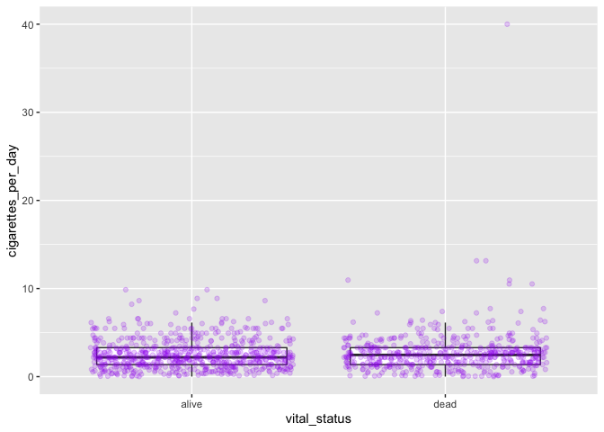
Challenge-comments
# assign data and aesthetics to object
my_plot <- ggplot(smoke_complete, aes(x = vital_status, y = cigarettes_per_day))
# start with data/aesthetics object
my_plot +
  # add geometry (boxplot)
  geom_boxplot(outlier.shape = NA) +
  # add jitter
  geom_jitter(alpha = 0.2, color = "purple")
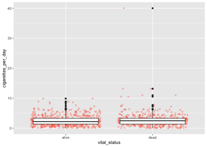
Challenge-order
Yes, the order matters.
ggplot(data=smoke_complete,
       aes(x=vital_status, y=cigarettes_per_day)) +
  geom_jitter(alpha=0.3, color="tomato") +
  geom_boxplot()
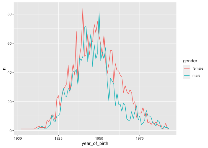
Challenge-line
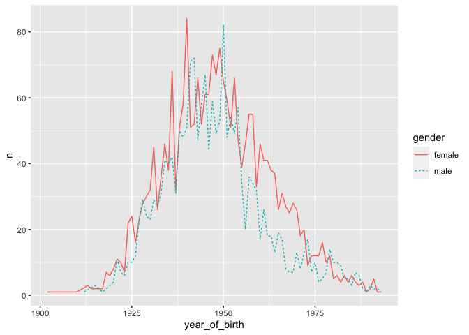
yearly_counts2 <- birth_reduced %>%
  count(year_of_birth, gender)
ggplot(data=yearly_counts2,
       aes(x=year_of_birth, y=n, color=gender)) +
  geom_line(aes(color=gender))
Challenge-dash
ggplot(data=yearly_counts2,
       aes(x=year_of_birth, y=n, color=gender)) +
  geom_line(aes(linetype=gender))
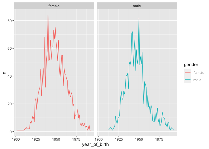
Challenge-panels
ggplot(data=yearly_counts2,
       aes(x=year_of_birth, y=n, color=gender)) +
  geom_line() +
  facet_wrap(~gender)
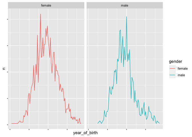
Challenge-axis
One possible search result here.
ggplot(data=yearly_counts2,
       aes(x=year_of_birth, y=n, color=gender)) +
  geom_line() +
  theme(axis.text.x = element_blank(), # hide labels
    axis.text.y = element_blank()) +
  facet_wrap(~gender)
Extra exercises
Challenge-improve
There are lots of options for this answer!